- Community & Alumni Engagement
- Community and Economic Engagement
- Public Policy Institute
- Regional Outlook Report
- Chapter 3: The State of Western North Carolina's Regional Economy
Chapter 3: The State of Western North Carolina's Regional Economy
INTRODUCTION
The effects of the Great Recession on the local economy were massive. Most counties in Western North Carolina have a long way to go to fully recover, even if the recession officially ended in 2009. Western North Carolina is in a state of change because of the slowed growth of its regional economy. This chapter focuses on this change and its possible implications. A comprehensive examination of the region’s economy in comparison with the nation and state’s economies has been conducted.
As shown in Table 3-1 and Figure 3-1, the national economy has been growing slowly
since 2009. The economy of North Carolina grew faster than the U.S. economy in 2012.
Nationally, North Carolina ranked ninth in gross domestic product and eleventh in
gross state product growth rate in 2012 (See Appendix Table A-1 for details).
| Table 3-1. Gross Domestic Product | ||||||
| Western North Carolina* | North Carolina | United States | ||||
| Value | Growth Rate | Value | Growth Rate | Value | Growth Rate | |
| 2000 | $28,874.2 | - | $316,598.0 | - | $11,225,406.0 | - |
| 2001 | $28,895.4 | 0.1% | $320,421.0 | 1.2% | $11,365,110.0 | 1.2% |
| 2002 | $29,001.7 | 0.4% | $324,302.0 | 1.2% | $11,559,801.0 | 1.7% |
| 2003 | $29,159.8 | 0.5% | $328,019.0 | 1.1% | $11,809,034.0 | 2.2% |
| 2004 | $29,773.8 | 2.1% | $335,831.0 | 2.4% | $12,199,532.0 | 3.3% |
| 2005 | $30,780.5 | 3.4% | $354,664.0 | 5.6% | $12,539,116.0 | 2.8% |
| 2006 | $31,429.1 | 2.1% | $369,556.0 | 4.2% | $12,875,816.0 | 2.7% |
| 2007 | $31,359.9 | -0.2% | $378,814.0 | 2.5% | $13,103,341.0 | 1.8% |
| 2008 | $30,658.8 | -2.2% | $377,869.0 | -0.2% | $13,016,791.0 | -0.7% |
| 2009 | $30,413.3 | -0.8% | $372,219.0 | -1.5% | $12,592,668.0 | -3.3% |
| 2010 | $30,191.7 | -0.7% | $380,693.0 | 2.3% | $12,897,088.0 | 2.4% |
| 2011 | $30,518.1 | 1.1% | $382,655.0 | 0.5% | $13,108,318.0 | 1.6% |
| 2012 | $30,903.1 | 1.3% | $392,905.0 | 2.7% | $13,430,576.0 | 2.5% |
In millions of 2005 dollars
* 2011 and 2012 values are estimates from Woods & Poole.
Source: Bureau of Economic Analysis, US Department of Commerce, and Woods and Poole
2013
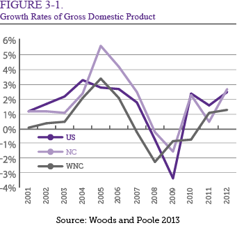
Western North Carolina’s economy was estimated to grow by 1.08 percent in 2011 and 1.26 percent in 2012, which is higher than the -0.73 percent growth that occurred in 2010. The WNC economy started expanding from a low point in 2010. Most key economic indicators predict a slow rebound after the recession.
STRUCTURE OF THE REGIONAL ECONOMY
The 2012 economic output of WNC, by industry, is shown in Table 3-2. In 2012, the
top three industries in WNC were manufacturing (28 percent), finance/insurance/real
estate (16 percent), and services (15 percent). Manufacturing accounted for more than
one-quarter of total production. In contrast, mining and agriculture made a very small
contribution to the regional economy, accounting for only 4 percent of total production
in 2012.
| Table 3-2. Industry Output in WNC in 2012 | |||||
| Industry | Output | Percent | Industry | Percent | |
| Ag, Forestry, Fish & Hunting | 1,104,384,081.48 | 1.79% | Agriculture and Mining | 3.95% | |
| Mining | 308,477,794.17 | 0.50% | Construction | 7.41% | |
| Utilities | 1,027,913,946.15 | 1.67% | Manufacturing | 28.01% | |
| Construction | 4,574,199,150.09 | 7.41% | Trade | 8.90% | |
| Manufacturing | 17,286,539,913.76 | 28.01% | Transporation and Information | 4.39% | |
| Wholesale Trade | 1,896,348,510.74 | 3.07% | Finance/Insurance/Real Estate | 15.69% | |
| Retail trade | 3,598,976,058.96 | 5.83% | Services | 15.31% | |
| Transportation & Warehousing | 1,242,203,150.75 | 2.01% | Accommodation and Others | 7.83% | |
| Information | 1,468,695,955.75 | 2.38% | Government | 8.49% | |
| Finance & insurance | 3,619,510,890.96 | 5.86% | Total | 100.00% | |
| Real estate & rental | 6,064,034,353.26 | 9.83% | |||
| Professional- scientific & tech svcs | 1,900,572,269.44 | 3.08% | |||
| Management of companies | 530,970,336.91 | 0.86% | |||
| Administrative & waste services | 1,297,161,273.96 | 2.10% | |||
| Educational svcs | 405,145,904.54 | 0.66% | |||
| Health & social services | 5,314,936,882.02 | 8.61% | |||
| Arts- entertainment & recreation | 552,990,961.07 | 0.90% | |||
| Accomodation & food services | 2,218,902,595.52 | 3.60% | |||
| Other services | 2,062,066,913.60 | 3.34% | |||
| Government & non NAICs | 5,241,136,605.74 | 8.49% | |||
| Total | 61,715,167,548.88 | 100.00% | |||
Source: IMPLAN Data 2012
NORTH CAROLINA'S SEVEN ECONOMIC DEVELOPMENT REGIONS
North Carolina has designated seven regional development partnerships that capture
all 100 of the state’s counties (see Map 3-1). The twenty-three westernmost counties
are known as the AdvantageWest region, which covers approximately 10,000 square miles.
This study focuses on the economy of this region.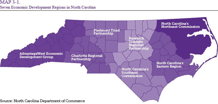
As shown in Table 3-3, the population growth rate of the AdvantageWest region is declining. This trend is further demonstrated by longer-term data. In 1980, 13.7 percent of the state’s population resided in the western twenty-three counties. By 1990, this figure fell to 12.9 percent. Then, in 2000 and 2010, the population fell to 12.4 percent and 11.5 percent respectively.
|
Table 3-3. Key Indicators by Economic Development Region in North Carolina
|
||||||||
| Indicator | NC | Advantage West | Charlotte | Piedmont Triad | Research Triangle | Northeast | Southeast | Eastern |
| Number of Counties | 100 | 23 | 12 | 12 | 13 | 16 | 11 | 13 |
| Population | ||||||||
| 2013 estimate | 10,018,744 | 1,147,042 | 2,372,382 | 1,705,301 | 2,177,876 | 427,953 | 1,154,732 | 1,033,458 |
| 2010 Census | 9,535,483 | 1,099,165 | 2,258,314 | 1,640,717 | 2,021,948 | 423,553 | 1,101,381 | 978,250 |
| Distribution by Region (%) 2010 | 100% | 11.5% | 23.7% | 17.2% | 21.2% | 4.4% | 11.6% | 10.3% |
| Distribution by Region (%) 2000 | 100% | 12.4% | 22.5% | 18.2% | 19.2% | 4.3% | 12.0% | 11.4% |
| Percent of White population 2010 | 68.5% | 90.4% | 69.3% | 69.9% | 65.0% | 56.0% | 59.0% | 63.7% |
| Percent of Black population 2010 | 21.5% | 4.3% | 20.6% | 20.7% | 23.0% | 39.4% | 26.5% | 27.7% |
| Percent of Hispanic population 2010 | 8.4% | 5.3% | 9.3% | 8.7% | 10.3% | 3.6% | 7.8% | 8.3% |
| Population by age, 2010 (April 1) | ||||||||
| Under 17 | 23.9% | 21.4% | 23.1% | 22.2% | 24.4% | 34.0% | 23.4% | 25.6% |
| 18 to 64 | 63.1% | 60.7% | 65.3% | 63.7% | 64.8% | 52.2% | 63.5% | 62.0% |
| 65 and up | 12.9% | 17.9% | 11.6% | 14.1% | 10.7% | 13.8% | 13.1% | 12.4% |
| Median Age in Years* | 37.40 | 44.30 | 39.30 | 40.75 | 38.60 | 42.00 | 38.40 | 38.25 |
| Males per 100 females* | 94.90 | 98.60 | 89.70 | 89.20 | 93.70 | 128.00 | 93.00 | 103.20 |
| Income | ||||||||
| Median household income, 2007-2011 | $46,291.0 | $38,148.8 | $46,958.7 | $41,872.7 | $47,687.1 | $40,648.3 | $38,656.6 | $40,932.9 |
| Average household income, 2011 | $54,863.5 | $50,486.2 | $62,014.8 | $55,246.0 | $62,755.2 | $52,544.8 | $51,832.6 | $53,180.4 |
| Per capita income**, 2007-2011 | $25,256.0 | $21,430.3 | $23,803.0 | $22,268.3 | $24,635.5 | $20,921.9 | $20,633.8 | $21,507.8 |
| Persons below poverty level (%), 2011*** | 16.1% | 17.3% | 13.8% | 16.4% | 13.6% | 19.7% | 19.8% | 19.0% |
Source: US Census and Woods & Poole 2013
* Average of counties in each region
** Per capita income in the past 12 months (in 2011 inflation-adjusted dollars), 2007-2011
*** Access NC, North Carolina Department of Commerce
Other demographic shifts have accompanied the region’s change in population. For example, the median age of the regional population was 44.3 years in 2010, which was the highest among the state’s seven economic development regions. In 2010, the white population in the region was 90.4 percent, again the highest in the state.
During 2007-2011, the per capita personal income in North Carolina was $25,256, which was 90.5 percent of the national average. Comparatively, the regional per capita personal income in the AdvantageWest region was $21,430, which was lower than the statewide average and only 76.8 percent of the national average.
During 2007-2011, median household income in the state of North Carolina was $46,291. In the AdvantageWest region, median household income during 2007-2011 was $38,149, which was 82.5 percent of the statewide average. It was the lowest in the seven regions of the state.
Income disparities across the state persist as poverty increases. In 2010, the average U.S. and state poverty rates were 15.1 percent. During 2007-2011, the percentage of people in the region living below the poverty level was 17.3 percent, slightly higher than the statewide average of 16.1 percent (See Appendix Table A-2 for details). Table 3-3 demonstrates these key indicators and economic variables to show the AdvantageWest region’s ranking in relation to the rest of the state .
EMPLOYMENT
The industrial structure of WNC has changed since the 1970s. Table 3-4 shows employment
trends by sector over the past forty-two years. Since 1970, the percentage increase
in total employment over each ten-year period has declined from 29.8 percent growth
to -0.2 percent growth by 2010. Total employment then increased 11.0 percent between
2010 and 2012.
| Table 3-4. Trends in Employment by Sector in Western North Carolina 1970-2012 | |||||||||||||||
| Sector | 1970 | 1980 | 1990 | 2000 | 2010 | 2012 | Growth Rate | ||||||||
| 70-80 | 80-90 | 90-00 | 00-10 | 10-12 | 70-12 | ||||||||||
| Total Employment | 286.64 | 371.917 | 455.23 | 554.429 | 553.549 | 565.752 | 29.8% | 22.4% | 21.8% | -0.2% | 2.2% | 97.4% | 23.3% | ||
| Farm Employment | 15.872 | 21.438 | 16.336 | 16.492 | 13.048 | 12.328 | 35.1% | -23.8% | 1.0% | -20.9% | -5.5% | -22.3% | -4.4% | ||
| Forestry, Fishing, Related Activities and Other Emp | 0.56 | 1.019 | 2.029 | 2.48 | 2.449 | 2.643 | 82.0% | 99.1% | 22.2% | -1.3% | 7.9% | 372.0% | 84.3% | ||
| Mining Employment | 0.907 | 1.029 | 1.027 | 1.143 | 1.573 | 1.599 | 13.5% | -0.2% | 11.3% | 37.6% | 1.7% | 76.3% | 18.4% | ||
| Utilities Employment | 1.768 | 2.321 | 3.323 | 1.652 | 1.442 | 1.483 | 31.3% | 43.2% | -50.3% | -12.7% | 2.8% | -16.1% | -4.6% | ||
| Construction Employment | 15.728 | 22.337 | 31.566 | 45.015 | 41.114 | 40.564 | 42.0% | 41.3% | 42.6% | -8.7% | -1.3% | 157.9% | 40.4% | ||
| Manufacturing Employment | 101.468 | 116.409 | 116.368 | 103.419 | 51.074 | 52.161 | 14.7% | 0.0% | -11.1% | -50.6% | 2.1% | -48.6% | -12.4% | ||
| Wholesale Trade Employment | 8.007 | 7.825 | 10.649 | 14.638 | 13.712 | 14.213 | -2.3% | 36.1% | 37.5% | -6.3% | 3.7% | 77.5% | 17.8% | ||
| Retail Trade Employment | 24.686 | 36.339 | 54.332 | 65.75 | 62.916 | 65.307 | 47.2% | 49.5% | 21.0% | -4.3% | 3.8% | 164.6% | 38.7% | ||
| Transportation and Warehousing Employment | 6.166 | 7.99 | 10.371 | 13.136 | 12.478 | 12.936 | 29.6% | 29.8% | 26.7% | -5.0% | 3.7% | 109.8% | 25.6% | ||
| Information Employment | 3.99 | 4.685 | 5.697 | 7.124 | 5.885 | 5.761 | 17.4% | 21.6% | 25.0% | -17.4% | -2.1% | 44.4% | 11.9% | ||
| Finance and Insurance Employment | 5.909 | 9.301 | 9.699 | 12.665 | 17.524 | 17.135 | 57.4% | 4.3% | 30.6% | 38.4% | -2.2% | 190.0% | 49.1% | ||
| Real Estate and Rental and Lease Employment | 7.026 | 10.926 | 11.799 | 17.021 | 27.028 | 27.738 | 55.5% | 8.0% | 44.3% | 58.8% | 2.6% | 294.8% | 71.2% | ||
| Professional and Technical Services Employment | 5.715 | 7.635 | 11.833 | 17.98 | 23.234 | 24.072 | 33.6% | 55.0% | 51.9% | 29.2% | 3.6% | 321.2% | 76.6% | ||
| Management of Companies and Enterprises Emp | 0.902 | 1.27 | 1.924 | 3.12 | 3.44 | 3.745 | 40.8% | 51.5% | 62.2% | 10.3% | 8.9% | 315.2% | 70.3% | ||
| Administrative and Waste Services Employment | 6.277 | 8.255 | 12.54 | 23.025 | 28.789 | 30.861 | 31.5% | 51.9% | 83.6% | 25.0% | 7.2% | 391.7% | 89.7% | ||
| Educational Services Employment | 1.302 | 1.729 | 2.757 | 4.789 | 7.98 | 8.556 | 32.8% | 59.5% | 73.7% | 66.6% | 7.2% | 557.1% | 128.2% | ||
| Health Care and Social Assistance Employment | 16.089 | 21.276 | 32.624 | 52.545 | 67.276 | 68.691 | 32.2% | 53.3% | 61.1% | 28.0% | 2.1% | 326.9% | 79.5% | ||
| Arts, Entertainment, and Recreation Employment | 3.086 | 4.252 | 6.548 | 10.698 | 13.633 | 14.055 | 37.8% | 54.0% | 63.4% | 27.4% | 3.1% | 355.4% | 85.4% | ||
| Accommodation and Food Services Employment | 13.154 | 18.236 | 27.957 | 37.076 | 42.968 | 45.613 | 38.6% | 53.3% | 32.6% | 15.9% | 6.2% | 246.8% | 56.7% | ||
| Other Services, Except Public Admin Employment | 11.242 | 15.181 | 23.613 | 29.856 | 34.402 | 36.032 | 35.0% | 55.5% | 26.4% | 15.2% | 4.7% | 220.5% | 51.5% | ||
| Federal Civilian Government Employment | 4.89 | 5.321 | 5.463 | 5.74 | 6.186 | 6.301 | 8.8% | 2.7% | 5.1% | 7.8% | 1.9% | 28.9% | 6.6% | ||
| Federal Military Employment | 3.634 | 2.817 | 3.26 | 2.804 | 2.776 | 2.792 | -22.5% | 15.7% | -14.0% | -1.0% | 0.6% | -23.2% | -5.9% | ||
| State and Local Government Employment | 28.262 | 44.326 | 53.515 | 66.261 | 72.622 | 71.166 | 56.8% | 20.7% | 23.8% | 9.6% | -2.0% | 151.8% | 39.2% | ||
Source: Woods and Poole 2013 in thousands of jobs
A decline in farm employment since 1980 has had a significant negative effect on total
regional employment. Between 1980 and 1990, farm employment declined 23.8 percent,
followed by a decline of 20.9 percent between 2000 and 2010. The only exception was
a small increase of 1.0 percent between 1990 and 2000. Nonfarm employment has not
been able to fully absorb this shift, particularly in light of declines in other employment
sectors.
In the private, nonfarm sector, the manufacturing industry lost a significant number
of jobs between 1990 and 2010. Approximately 50.6 percent of the jobs in the manufacturing
industry were lost between 2000 and 2010. The loss of jobs in the manufacturing industry
is attributed to numerous factors, but is primarily the result of outsourcing goods
overseas. Many layoffs occurred, leading to a tremendous loss of jobs in the furniture
and textile industries. Then, several industries in other employment sectors experienced
a decline in the number of jobs between 2000 and 2010. Affected industries include
construction, wholesale trade, retail trade, and transportation. The utilities industry
lost 12.7 percent of its employment between 2000 and 2010, while the information industry
lost about 17.4 percent of its employment.
Between 2000 and 2010, most new job creation occurred in the real estate and education sectors. The real estate sector experienced about a 58.8 percent increase in new jobs, while the education sector experienced about a 66.6 percent increase. Business and health services are also growing rapidly in WNC. The growth in this category will bring additional jobs to the regional economy. Currently, the business management industry has experienced significant growth and presents a promising outlook for the future job market.
As depicted in Figure 3-2, total employment in WNC has fluctuated over the last two
decades, even when controlling for seasonality, which more accurately reflects employment
behavior.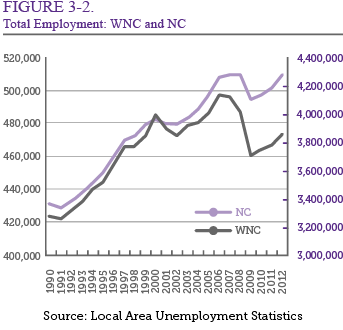
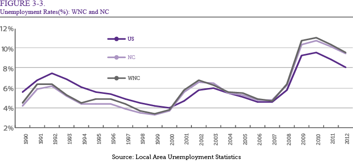
Figure 3-3 shows unemployment rates for WNC and North Carolina since 1990. Historical
data indicates that the unemployment rate decreased between 1991 and 2000 in both
WNC and North Carolina. During this same period, total employment fluctuated significantly.
In 2002, the state entered an expansion period. Total employment increased drastically
while the unemployment rate decreased. The unemployment rate started to decrease in
2002 until the Great Recession started in 2007. During this economic recession, the
unemployment rate of WNC was more than 11 percent but decreased to 9.6 percent in
2012.
LOCATION QUOTIENT ANALYSIS
In examining the local, regional, state, or national economy, it is important to identify the unique characteristics of an economy’s industrial structure because these characteristics provide an indication of each industry’s likely contribution to the overall economy. In North Carolina, for example, traditional manufacturing industries such as apparel, furniture, textiles, and tobacco have been shrinking for several years and could have a negative effect on an economic forecast.
In 2012, the top five employment industries in North Carolina were government and non-NAICs (that is, unclassified in by the North American Industry Classification System), health and social services, retail trade, manufacturing, and construction. In comparison, WNC’s top five industries in terms of employment are government and non-NAICs, health and social services, retail trade, manufacturing, and accommodation and food services. The government and non-NAICs account for 14.6 percent of employment in WNC.
Location quotients are frequently used when performing an economic analysis. They indicate the employment density of an economy by industry based on the overall state economy. In other words, location quotients are one way to measure an industry’s labor concentration in a specific region relative to the rest of the state by simply taking an industry’s share of regional employment and dividing it by the industry’s share of state employment. If the location quotient of an industry is 1, then the industry’s share of regional employment is the same as the industry’s share of employment in the state. For example, in Table 3-5, the employment shares for arts and recreation services in WNC and in North Carolina as a whole are 2.1 percent and 1.9 percent respectively, which equals a location quotient of 1.13 (the result of the regional percentage divided by the state percentage).
If the location quotient of an industry is greater than 1, it means the industry employs a larger share of the work force regionally than on a statewide basis. It is more likely that the region is a net exporter in an industry if the location quotient is greater than 1 because the region produces more goods or services than would be consumed regionally. In contrast, if the location quotient of an industry is less than 1, the region produces less than enough goods or services to meet area demand, and thus is typically an import industry. Investors and entrepreneurs may view areas with location quotients of less than 1 as opportunities to develop businesses in the local area.
A statistical confidence interval defines a range with a specified probability by creating an upper and lower limit for the mean. For location quotient analysis, the rule of thumb to understand the statistical confidence interval is ±0.15. This means that a location quotient between 0.85 and 1.15 is likely to be considered 1, which indicates that the difference between regional and statewide employment shares is not significant.
As shown in Table 3-5, in WNC, the top five employment-share industries are mining
(LQ = 1.44), utilities (LQ = 1.39), construction (LQ = 1.33), real estate and rental
(LQ = 1.23), and health and social services (LQ = 1.22).
| Table 3-5. Location Quotient | ||||||
| NAICS* | Sector | Western North Carolina | North Carolina | Location Quotient | ||
| Employment | Percent | Employment | Percent | |||
| 11 | Ag, Forestry, Fish & Hunting | 9,633.50 | 1.76% | 83,576.38 | 1.61% | 1.09 |
| 21 | Mining | 1,241.47 | 0.23% | 8,207.19 | 0.16% | 1.44 |
| 22 | Utilities | 1,915.17 | 0.35% | 13,104.11 | 0.25% | 1.39 |
| 23 | Construction | 42,571.57 | 7.78% | 304,980.06 | 5.87% | 1.33 |
| 31-33 | Manufacturing | 49,647.08 | 9.08% | 439,058.19 | 8.45% | 1.07 |
| 42 | Wholesale Trade | 13,487.59 | 2.47% | 177,807.02 | 3.42% | 0.72 |
| 44-45 | Retail Trade | 62,381.09 | 11.40% | 521,942.75 | 10.05% | 1.13 |
| 48-49 | Transportation & Warehousing | 14,753.65 | 2.70% | 133,340.97 | 2.57% | 1.05 |
| 51 | Information | 5,735.03 | 1.05% | 79,685.07 | 1.53% | 0.68 |
| 52 | Finance & Insurance | 20,021.15 | 3.66% | 282,428.86 | 5.44% | 0.67 |
| 53 | Real Estate & Rental | 27,877.83 | 5.10% | 216,023.60 | 4.16% | 1.23 |
| 54 | Professional- Scientific & Tech Services | 24,040.86 | 4.39% | 299,952.93 | 5.77% | 0.76 |
| 55 | Management of companies | 3,689.79 | 0.67% | 73,124.76 | 1.41% | 0.48 |
| 56 | Administrative & Waste Services | 28,089.10 | 5.13% | 323,402.24 | 6.23% | 0.82 |
| 61 | Educational Services | 7,786.20 | 1.42% | 102,246.73 | 1.97% | 0.72 |
| 62 | Health & Social Services | 67,410.50 | 12.32% | 522,638.02 | 10.06% | 1.22 |
| 71 | Arts- Entertainment & Recreation | 11,759.66 | 2.15% | 98,887.35 | 1.90% | 1.13 |
| 72 | Accommodation & Food Services | 41,032.86 | 7.50% | 361,238.84 | 6.95% | 1.08 |
| 81 | Other Services | 33,987.81 | 6.21% | 281,129.89 | 5.41% | 1.15 |
| 92 | Government & Non NAICs | 80,003.13 | 14.62% | 871,577.73 | 16.78% | 0.87 |
| Total | 547,065.04 | 100.00% | 5,194,352.68 | 100.00% | ||
Source: IMPLAN Data 2012
* NAICS stands for North American Indutry Classification System
In the service industry, WNC has relatively large employment shares in tourism and
health services. Service industry employment includes all nonfarm, private industry
employment. The location quotients are 1.08 for accommodations and food services,
1.13 for arts – entertainment and recreation, and 1.22 for health and social services.
However, for finance and insurance (LQ = 0.67), professional – scientific and tech
services (LQ = 0.76), and management of companies (LQ = 0.48), the region employs
a lower percentage of the work force than the state employment percentage despite
the positive employment outlook discussed in the previous section. A location quotient
less than 0.75 may indicate the region is not self-sufficient in that industry. However,
for location quotients greater than 0.75, there may be evidence that the local economy
is self-sufficient in that industry.
ECONOMIC MULTIPLIER ANALYSIS
Any initial spending has a ripple effect through the economy as successive rounds of re-spending enlarge its impact. For instance, a tourist spending at a restaurant stimulates related suppliers to provide ingredients and materials to produce more food. These effects can be captured by economic impact analysis using multipliers. The impact from a change in economic activity can be expressed in a concise form by examining a multiplier. The secondary impact of a dollar spent on primary activities varies from industry to industry. In general, manufacturing industries show larger secondary impacts than service industries. In terms of economic development issues, it is important to understand the difference in multiplier effects by industry.
An economic impact analysis normally differentiates three effects: the direct, the indirect, and the induced effects. Understanding all three levels of effects is essential because they represent and display how the initial expenditures create economic activity that goes beyond the initial investment. The direct effect is the original impact of new spending on the first tier of suppliers. For example, $20 spent by a visitor at a local restaurant (first tier) counts as a direct effect of $20. However, this share of spending indicates only a portion of the total economic activity that takes place.
In order to produce the $20 meal, the local restaurant has to purchase inputs from second-tier suppliers. Suppose the restaurant purchases $7 worth of agricultural products from a wholesale dealer (the second-tier supplier). The wholesale dealer then buys $4 worth of products from local farmers (the third-tier supplier). To the extent that these transactions occur locally, these purchases represent additional local spending, which are called indirect effects. In this example, the indirect effects would be $11. Various sectors of the economy are highly affected by an increase in visitor spending.
The third type of effect, induced, can be derived from wages paid by employers involved directly and indirectly in producing the meal. The part of the wages spent locally by households that received wage income associated with this meal from either the first, second, or third-tier suppliers would be induced effects. Suppose the household of a restaurant worker spends $6 in the local grocery and department store. The total effects – the sum of direct ($20), indirect ($11), and induced ($6) effects – would be $37. In this case, the multiplier will be 1.85. This means that every dollar spent on a certain industry eventually has a total impact of $1.85 on the local economy.
| Table 3-6. Employment and Output Multipliers | |||
| NAICS | Sector | Western North Carolina | |
| Employment | Output | ||
| 11 | Ag, Forestry, Fish & Hunting | 1.66 | 1.62 |
| 21 | Mining | 1.85 | 1.38 |
| 22 | Utilities | 2.18 | 1.21 |
| 23 | Construction | 1.58 | 1.51 |
| 31-33 | Manufacturing | 2.13 | 1.34 |
| 42 | Wholesale Trade | 1.69 | 1.47 |
| 44-45 | Retail Trade | 1.36 | 1.62 |
| 48-49 | Transportation & Warehousing | 1.54 | 1.60 |
| 51 | Information | 2.24 | 1.49 |
| 52 | Finance & Insurance | 2.15 | 1.68 |
| 53 | Real Estate & Rental | 1.38 | 1.19 |
| 54 | Professional- Scientific & Tech Services | 1.55 | 1.66 |
| 55 | Management of companies | 2.03 | 1.70 |
| 56 | Administrative & Waste Services | 1.33 | 1.64 |
| 61 | Educational Services | 1.40 | 1.82 |
| 62 | Health & Social Services | 1.57 | 1.71 |
| 71 | Arts- Entertainment & Recreation | 1.33 | 1.64 |
| 72 | Accommodation & Food Services | 1.30 | 1.55 |
| 81 | Other Services | 1.45 | 1.73 |
| 92 | Government & Non NAICs | 1.42 | 1.61 |
Source: IMPLAN Data 2012
The multiplier effect also can be estimated in the number of jobs created by an external shock or extra spending, such as new company or visitor spending. Table 3-6 shows employment and output multipliers by industry. Note that induced effects are not included in the estimation because no transactions have actually yet occurred. As a result, the total effects will change significantly when we consider real impacts. However, it still can provide baseline information on the magnitude of indirect effects of each industry.
As shown in Table 3-6, the information industry (whose employment multiplier – direct + indirect – is 2.24) has the largest indirect effects on the economy, followed by utilities (2.18) and the finance and insurance industry (2.15). For the information industry, there will be 2.24 jobs created or maintained in WNC for every one job resulting from the initial spending.
TOURISM
County-specific data are very rare in the tourism sector. However, the Research Department of the U.S. Travel Association prepares county-by-county travel economic impact statistics for the N.C. Department of Commerce’s Division of Tourism, Film, and Sports Development, using the Travel Economic Impact Model (TEIM). In addition to the direct visitor spending estimates for all 100 North Carolina counties, this research includes expenditures, payroll, employment, state tax receipts, and local tax receipts.
Table 3-7a shows the changes in these five indicators from 2000-2012. All five indicators show a percentage decrease in WNC between 2001 and 2003, most likely the result of the 2001 terrorist attacks and the impact on travel. From 2003 to 2006, there is an increase in percentage in all five indicators, with a decrease in percentage between 2006 and 2009. This directly coincides with the Great Recession that started in 2007. From 2009 to 2010, most indicators see a percentage increase, then a decrease between 2010 and 2012. The tendency for all five indicators to follow the same pattern changes between 2009 and 2012 when payroll and employment experienced an increase in percentage.
Overall, the biggest change in percentage was between 2001 and 2003. During these years, payroll decreased from 16.1 percent to -0.8 percent, employment decreased from 10.9 percent, and state tax receipts decreased from 12.5 percent to 0.6 percent. Exceptions were expenditures and local tax receipts, which had the biggest change in percentage between 2006 and 2009. During these years, expenditures decreased from 9.0 percent to -6.0 percent, while local tax receipts decreased from 8.1 percent to -5.0 percent. If we compare this information with the increase in percentage in payroll and employment between 2009 and 2012, we can infer that the spike in expenditures and local tax receipts in 2010 led to an increase in the workforce.
| Table 3-7a. Economic Impact of Travel on Western North Carolina | ||||||||||
| Expenditures $(millions) | Payroll $(millions) | Employment (thousands) | State Tax Receipts $(millions) | Local Tax Receipts $(millions) | ||||||
| Year | Value | %Chg | Value | %Chg | Value | %Chg | Value | %Chg | Value | %Chg |
| 2000 | 1,632.8 | - | 400.8 | - | 24.9 | - | 87.8 | - | 74.1 | - |
| 2001 | 1,767.5 | 8.3% | 465.4 | 16.1% | 27.6 | 10.9% | 98.7 | 12.5% | 75.6 | 2.0% |
| 2002 | 1,871.1 | 5.9% | 474.0 | 1.9% | 28.1 | 1.9% | 101.6 | 3.0% | 79.5 | 5.2% |
| 2003 | 1,889.4 | 1.0% | 470.1 | -0.8% | 27.5 | -2.3% | 102.2 | 0.6% | 80.3 | 1.0% |
| 2004 | 1,951.6 | 3.3% | 466.1 | -0.8% | 27.0 | -1.7% | 104.6 | 2.3% | 83.0 | 3.3% |
| 2005 | 2,083.4 | 6.8% | 477.0 | 2.3% | 27.2 | 0.8% | 109.5 | 4.7% | 87.3 | 5.2% |
| 2006 | 2,270.2 | 9.0% | 494.7 | 3.7% | 27.7 | 1.7% | 117.5 | 7.3% | 94.4 | 8.1% |
| 2007 | 2,410.7 | 6.2% | 508.3 | 2.7% | 27.9 | 0.9% | 119.0 | 1.3% | 99.7 | 5.6% |
| 2008 | 2,387.6 | -1.0% | 508.7 | 0.1% | 27.1 | -2.9% | 119.3 | 0.3% | 99.7 | 0.0% |
| 2009 | 2,245.3 | -6.0% | 479.4 | -5.8% | 26.2 | -3.5% | 121.0 | 1.4% | 94.8 | -5.0% |
| 2010 | 2,413.5 | 7.5% | 484.7 | 1.1% | 26.2 | 0.0% | 134.4 | 11.1% | 99.5 | 5.0% |
| 2011 | 2,574.5 | 6.7% | 500.6 | 3.3% | 26.5 | 1.0% | 135.0 | 0.5% | 101.5 | 2.0% |
| 2012 | 2,711.5 | 5.3% | 524.0 | 4.7% | 27.1 | 2.4% | 134.7 | -0.2% | 105.7 | 4.1% |
Source: Travel Economic Impact Model (TEIM), North Carolina Department of Commerce
| Table 3-7b. Year-to-Year Changes in Tourists at Welcome Center | |||||||||
| Location | 2006 | 2007 | 2008 | 2009 | 2010 | 2011 | 2012 | 2013* | |
| I-26 East | Visitors | 73,691 | 61,448 | 55,350 | 53,665 | 54,635 | 54,205 | 54,749 | 52,278 |
| %Chg | - | -16.6% | -9.9% | -3.0% | 1.8% | -0.8% | 1.0% | -4.5% | |
| I-26 West | Visitors | 31,514 | 29,841 | 27,940 | 31,825 | 29,021 | 23,261 | 24,008 | 22,121 |
| %Chg | - | -5.3% | -6.4% | 13.9% | -8.8% | -19.8% | 3.2% | -7.9% | |
| I-40 West | Visitors | 85,215 | 86,939 | 77,385 | 60,832 | 61,821 | 79,439 | 80,645 | 75,435 |
| %Chg | - | 2.0% | -11.0% | -21.4% | 1.6% | 28.5% | 1.5% | -6.5% | |
| I-77 North | Visitors | 97,600 | 96,168 | 85,183 | 87,614 | 84,655 | 80,484 | 82,703 | 75,474 |
| %Chg | - | -1.5% | -11.4% | 2.9% | -3.4% | -4.9% | 2.8% | -8.7% | |
| I-77 South | Visitors | 33,189 | 29,030 | 25,811 | 24,159 | 25,922 | 24,403 | 26,967 | 28,323 |
| %Chg | - | -12.5% | -11.1% | -6.4% | 7.3% | -5.9% | 10.5% | 5.0% | |
| I-85 North | Visitors | 57,880 | 57,746 | 52,764 | 60,924 | 56,385 | 52,263 | 52,509 | 49,877 |
| %Chg | - | -0.2% | -8.6% | 15.5% | -7.4% | -7.3% | 0.5% | -5.0% | |
| I-85 South | Visitors | 75,621 | 55,688 | 47,898 | 45,889 | 47,737 | 52,620 | 58,690 | 57,686 |
| %Chg | - | -26.4% | -14.0% | -4.2% | 4.0% | 10.2% | 11.5% | -1.7% | |
| I-95 North | Visitors | 154,419 | 147,276 | 135,699 | 134,364 | 136,506 | 130,839 | 133,163 | 124,089 |
| %Chg | - | -4.6% | -7.9% | -1.0% | 1.6% | -4.2% | 1.8% | -6.8% | |
| I-95 South | Visitors | 108,877 | 107,861 | 95,688 | 73,113 | 95,408 | 94,397 | 95,181 | 90,667 |
| %Chg | - | -0.9% | -11.3% | -23.6% | 30.5% | -1.1% | 0.8% | -4.7% | |
| Total | Visitors | 718,005 | 671,997 | 603,717 | 572,384 | 592,090 | 591,912 | 608,614 | 565,173 |
| %Chg | - | -6.4% | -10.2% | -5.2% | 3.4% | 0.0% | 2.8% | -7.1% | |
Source: North Carolina Department of Commerce
* January through July only
Year-to-year changes in tourists at welcome centers on North Carolina’s interstates
are depicted in Table 3-7b. Welcome centers are located on all major interstates and
focus on providing visitors with in-depth information. Between 2006 and 2013, there
was a negative change in tourists at visitor centers located on many interstates,
including I-26 West, I-26 East, I-40 West, I-85 North, I-95 North, and I-77 North.
In 2010, I-85 South, I-95 South, and I-77 South experienced an increase in the percentage
of visitors traveling interstates. Interstate 95 South experienced the largest increase
with an approximate change of 30.5 percent. In WNC, Interstate 40 West attracts the
most tourists; approximately 75,435 as of 2013. On the other hand, I-85 North experienced
the largest decrease in travelers in 2013, an approximate drop of 8.7 percent. Furthermore,
there are few tourists who visit welcome centers on I-26 West. Overall, it appears
that tourism in WNC is declining slightly.
HOUSING
Table 3-8 displays housing data for the WNC region as a whole, including data on total housing units, median gross rent, median value of owner-occupied residential properties, number of owner occupied units, and number of seasonal housing units. The largest percentage of change in housing units for North Carolina and WNC specifically was between 1970 and 1980. In 1970, the total number of housing units in the state and the western region was 1,641,222 and 242,881 respectively. In 1980, the total number of housing units was 2,274,737 in the state and 342,504 in the region. Between 1970 and 1980, the percentage change in housing units for the state and the region was 38.6 percent and 41 percent, respectively.
Gross rent is estimated to be contract rent plus the estimated average monthly cost of utilities (to the extent that the renter also pays these). WNC’s percentage change in median gross rent from 2000 to 2010 is about the same as the percentage change for the state during this same period, an approximate increase of 32 percent. Between 2000 and 2010, approximately $141 was added to WNC’s gross monthly rent payment. Between 2000 and 2010, approximately $170 was added to North Carolina’s monthly gross rent payment. Thus, during this time, the state increase in terms of dollars was greater but the percentage increase was virtually equal.
The median value owner refers to the total dollar value of a residential property. The median value of property in the western region was $10,748 in 1970 and $150,350 in 2010. Between 1970 and 1980, the average total value of a residential unit rose 206.3 percent in WNC and 181.3 percent in North Carolina as a whole. Between 1980 and 2000, the median value of property in WNC remained fairly stable at approximately 71 percent. Between 2000 and 2010, the median value of property in WNC dropped 55.2 percent.
| Table 3-8. Housing in Western North Carolina: Year-to-Year Changes | |||||||||||
| Year | Housing Units | Med Gross Rent | Med Value Owner | Owner Occupied Units | Seasonal Housing Units | ||||||
| WNC | 1970 | 242,881 | - | $68 | - | $10,748 | - | 159,450 | - | 10,313 | - |
| 1980 | 342,504 | 41.0% | $172 | 154.8% | $32,917 | 206.3% | 219,363 | 37.6% | 18,556 | 79.9% | |
| 1990 | 405,590 | 18.4% | $299 | 73.1% | $56,604 | 72.0% | 254,813 | 16.2% | 36,244 | 95.3% | |
| 2000 | 491,650 | 21.2% | $428 | 43.3% | $96,896 | 71.2% | 308,257 | 21.0% | 46,453 | 28.2% | |
| 2010 | 592,230 | 20.5% | $569 | 33.0% | $150,350 | 55.2% | 329,664 | 6.9% | 74,453 | 60.3% | |
| North Carolina | 1970 | 1,641,222 | - | $86 | - | $12,800 | - | 987,079 | - | 23,119 | - |
| 1980 | 2,274,737 | 38.6% | $205 | 138.4% | $36,000 | 181.3% | 1,397,426 | 41.6% | 50,541 | 118.6% | |
| 1990 | 2,818,193 | 23.9% | $382 | 86.3% | $65,300 | 81.4% | 1,711,882 | 22.5% | 98,534 | 95.0% | |
| 2000 | 3,523,944 | 25.0% | $548 | 43.5% | $108,300 | 65.8% | 2,172,355 | 26.9% | 134,870 | 36.9% | |
| 2010 | 4,327,528 | 22.8% | $718 | 31.0% | $149,100 | 37.7% | 2,497,900 | 15.0% | 191,508 | 42.0% | |
Source: Log Into North Carolina (LINC)
Owner-occupied housing units are those in which the owner or co-owner lives in the
unit, even if the unit is mortgaged or not fully paid. In 1970, the number of owner
occupied units in North Carolina was 987,079 but steadily increased to 2,497,900 in
2010. In the western region, the number of owner-occupied housing units was 159,450
in 1970 and 329,664 in 2010. Between 1990 and 2000, WNC experienced a 21 percent increase
in owner occupied units. Between 2000 and 2010, owner occupied units in WNC increased
6.9 percent.
Housing units that are occupied only during certain seasons are referred to as seasonal housing units and include winter cabins or beach cottages. The percentage change in seasonal housing units in WNC from 1990 to 2000 was approximately 28 percent, approximately the same as the percentage change for North Carolina during the same time period. In 2010, the number of seasonal housing units in WNC was 74,453, an approximate increase of 60 percent since 2000. In 2010, the number of seasonal housing units in the state was 191,508, an increase of 42 percent since 2000.
Overall, the largest percentage change for all the housing data previously discussed occurred between 1970 and 1980. The in-depth economic analysis revealed that over a forty-year span, the number of housing units for both the state and the region steadily increased.
HEALTHCARE FACILITIES
Healthcare facilities in WNC strive to meet patient needs by providing an array of services. Table 3-9 displays health care data on hospital discharges and hospital and nursing facility beds for the twenty-three westernmost counties in North Carolina.
General hospital discharge refers to the “discharge of residents of the county in all short stay, acute care general hospitals in the state during the federal fiscal year.” [11] General hospital discharges do not include federal and state hospitals and psychiatric and rehabilitation care facilities. In 2009, patients released from health care facilities in WNC totaled 117,497. Buncombe County alone discharged 23,472 patients, which was more than any of the other twenty-two counties. At the other extreme, Clay County, with a population of 10,370 people, discharged approximately 878 patients, which is 0.79 percent of total regional patients.
Nursing facilities in the region provide less care than that offered by acute care hospitals. Thus, the above figures include only beds that are licensed as nursing facility beds. Approximately 17.24 percent of nursing facility beds statewide are located in WNC. According to a Log Into North Carolina report, this figure also includes “licensed long-term nursing care beds in non-federal, non-state general hospital.” [12] Log Into North Carolina is a valuable database for gathering statistical data for North Carolina, as it provides both historical data and future projections.
| Table 3-9. Healthcare Facilities in Western North Carolina in 2009 | ||||||
| General Hospital Discharge (A) | Nursing Facility Beds (B) | Beds in General Hospital (C) | (A) per 1000 persons | (B) per 1000 persons | (C) per 1000 persons | |
| Alleghany | 1,467 | 90 | 41 | 132.1 | 8.1 | 3.7 |
| Ashe | 3,196 | 210 | 76 | 118.4 | 7.8 | 2.8 |
| Avery | 2,268 | 128 | 30 | 127.1 | 7.2 | 1.7 |
| Buncombe | 23,472 | 1,668 | 673 | 99.5 | 7.1 | 2.9 |
| Burke | 9,725 | 556 | 293 | 107.4 | 6.1 | 3.2 |
| Caldwell | 8,736 | 400 | 110 | 105.9 | 4.8 | 1.3 |
| Cherokee | 2,649 | 210 | 57 | 97.5 | 7.7 | 2.1 |
| Clay | 878 | 90 | 0 | 83.7 | 8.6 | 0.0 |
| Graham | 994 | 80 | 0 | 113.3 | 9.1 | 0.0 |
| Haywood | 7,717 | 475 | 153 | 131.5 | 8.1 | 2.6 |
| Henderson | 11,737 | 912 | 263 | 111.4 | 8.7 | 2.5 |
| Jackson | 3,349 | 200 | 86 | 84.8 | 5.1 | 2.2 |
| McDowell | 4,665 | 250 | 65 | 104.0 | 5.6 | 1.4 |
| Macon | 3,266 | 284 | 83 | 96.5 | 8.4 | 2.5 |
| Madison | 1,996 | 180 | 0 | 96.6 | 8.7 | 0.0 |
| Mitchell | 2,014 | 127 | 46 | 129.1 | 8.1 | 2.9 |
| Polk | 1,671 | 221 | 45 | 82.4 | 10.9 | 2.2 |
| Rutherford | 7,289 | 420 | 129 | 108.4 | 6.2 | 1.9 |
| Swain | 2,312 | 120 | 48 | 166.8 | 8.7 | 3.5 |
| Transylvania | 3,315 | 267 | 42 | 101.1 | 8.1 | 1.3 |
| Watauga | 3,579 | 196 | 145 | 71.4 | 3.9 | 2.9 |
| Wilkes | 9,047 | 417 | 120 | 130.9 | 6.0 | 1.7 |
| Yancey | 2,155 | 140 | 0 | 120.6 | 7.8 | 0.0 |
| WNC | 117,497 | 7,641 | 2,505 | 106.7 | 6.9 | 2.3 |
| North Carolina | 967,560 | 44,315 | 20,647 | 102.7 | 4.7 | 2.2 |
Source: Log Into North Carolina (LINC)
As the most populous county in the western region, Buncombe County houses the most
people in nursing facilities in WNC, approximately 22 percent, as shown in Table 3-9.
Thus, Buncombe County nursing facilities have a large number of beds. Comparatively,
Buncombe County nursing facilities house approximately 3.76 percent of all nursing
patients in the state of North Carolina. The least populated counties – Alleghany,
Clay, Graham, and Swain – have the fewest number of beds, each with approximately
1 percent of WNC’s beds. Graham County houses the fewest people in WNC, approximately
80 out of the 7,641 total.
Beds in general hospitals are limited to beds that are for short-stay use only, “as licensed at the end of the third calendar quarter of the year.” [13] As with general hospital discharges, figures for beds in general hospitals exclude those used for psychiatry, hospice, and rehabilitation care. Clay, Graham, and Madison counties’ health care facilities do not provide acute care (in other words, they do not offer beds for short-stay use). In contrast, Buncombe, Burke and Henderson counties have many general hospital beds. Buncombe County alone houses approximately 27 percent of acute care patients in the region, while Burke and Henderson counties house approximately 11.7 percent and 10.5 percent of acute care patients respectively. Further, WNC provides approximately 12.13 percent of all acute care in the state.
SUMMARY
Overall, the WNC’s economy has been recovering since 2009. One of the most difficult challenges that the region has been facing is the slow growth of the population. The share of population of the AdvantageWest region in the state declined from 13.7 percent in 1980 to 11.5 percent in 2010. The median age of the regional population was 44.3 years in 2010, which was the highest among the state’s seven economic development regions. The share of population of the region aged between 18 and 64 was 60.7 percent, which was the lowest in the state except the Northeast region. It is still a controversial issue whether or not population growth has a positive impact on economic development. However, along with the slow growth of the population and the aging population, most economic indicators show that the region faces additional challenges compared to the rest of the state, including low workforce, low income, and high poverty rates.
11 Log Into North Carolina, NC State Data Center.
12 State Agency Data: Department of Health and Human Services. LINC. (2007). Retrieved on August 12, 2007 , from http://data.osbm.state.nc.us/pls/linc/dyn_linc_main.show
13 Ibid.