- About Western Carolina
- Communications and Marketing
- WCU Brand
- Visual Identity
Visual Identity
Western Carolina University's visual brand identity is not limited to the guidelines for use of the university logo or use of the correct color purple. Understanding and executing marketing or recruitment materials that bring the brand to life in look and feel requires embracing a variety of visual guidelines all intended to embody the brand personality.
![]()
Logo
The idea of a "logo" is, for many people, synonymous with "branding." While consistent and thoughtful use of the university logo is extremely important in the execution of marketing materials, WCU's logo is merely a work mark intended to clearly and directly communicate the name "Western Carolina." It carries some subtle nods to our brand personality, conveying a sense of connectedness and upward movement. That said, it should not be the only part of your marketing materials that conveys the brand.
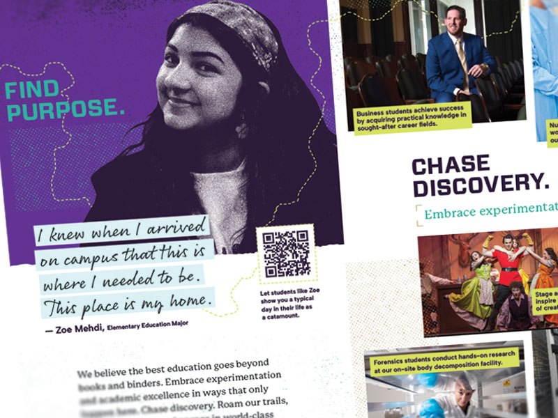
Color
One of the most powerful indicators of brand is the use of color. For this reason, the primary colors on any marketing materials should be purple and gold. However, some materials demand the use of more color variety to clearly communicate diverse topics or ideas. For this reason, WCU does offer accent and complementary colors that can be used in marketing design.

Fonts
Western Carolina uses a flexible family of fonts called Freight for all materials, digital and print. Freight was chosen because it is clear and readable without being cold or mechanical. It also offers tons of variety: five different fonts each with six varieties of text weight. Two of the five fonts are available to all faculty and staff, and faculty and staff are encouraged to use Freight fonts for all external-facing university documents.

Imagery
Western Carolina aims for photography that captures the authentic student experience, showing our supportive community and applied academic opportunities. Images should be active with a clear focal point. Photos should tell a story, often with one of our students (and when appropriate their faculty mentor) at the center of the story. Portraits should be photographed, when possible, in context with the experience.